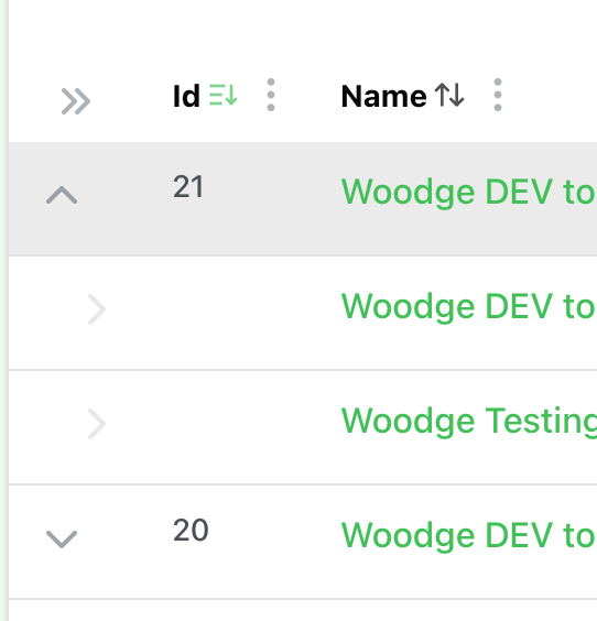
When looking at the deployment list in the OTTO FMS web interface if a deployment has sub deployments, but they are not expanded, then it is shown with a downward facing arrow.

When the deployment is expanded to show the sub deployments an upward arrow is shown.
I find this confusing as it is not the same behaviour as is used in MacOS and many other UI paradigms. For example in MacOS Finder when a folder is not expanded the arrow point right like so:
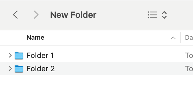
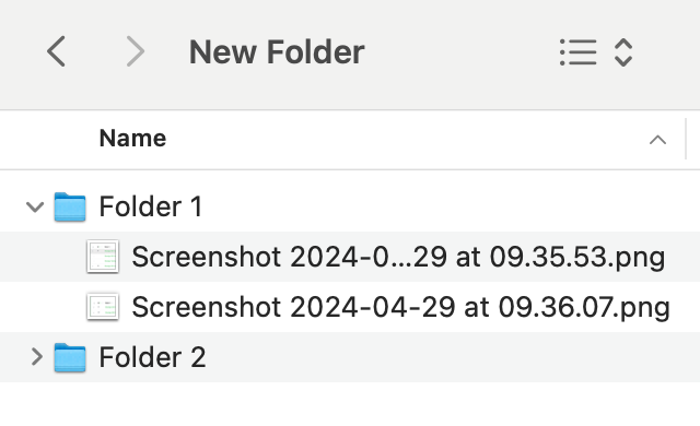
If a folder is expanded the the arrow points down:
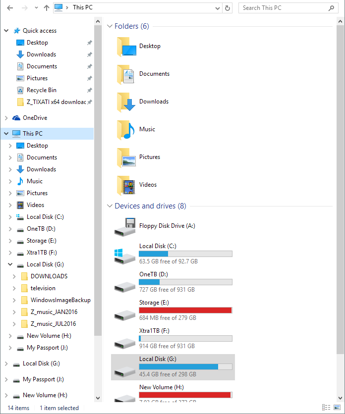
This seems to be the standard on windows as well.
I know that some web design systems like material design use up/down, but the this instances it seems to have much less clarity as to which items are expanded and which items are parents /children of each element.
In MacOS the name of the child file/folders is also indented which makes it clearer. In OTTO the sub-deployments names are not indented and it makes it more difficult to pick out from the list what is the name of the parent deployment verses the child sub-deployments.